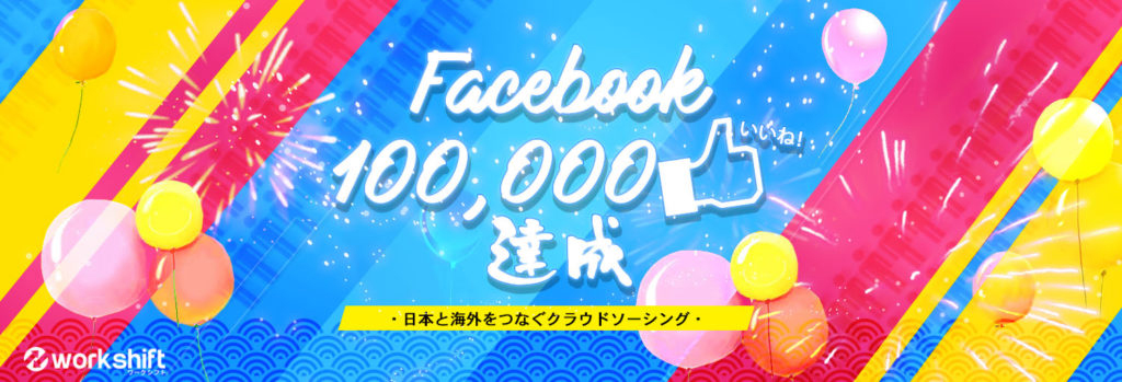
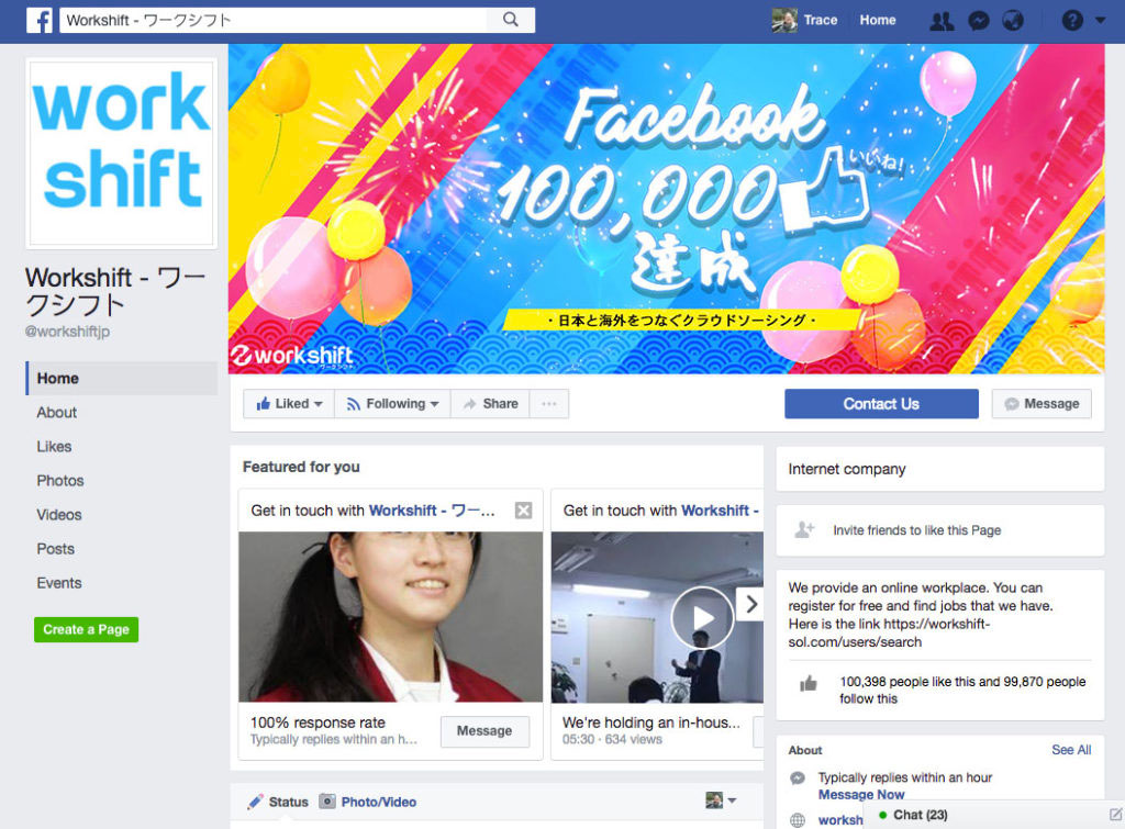
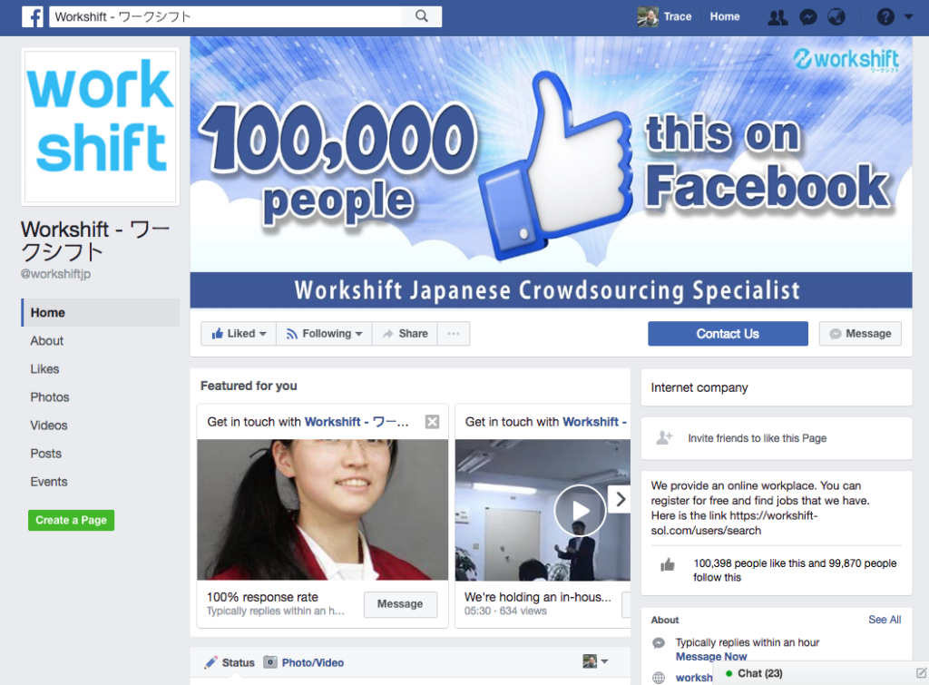
A online workplace called Workshift celebrated the achievement of “100,000 people like this” on Facebook and website by shown a related banner. This is a kind of competition with reward. Finally, I was fail to be chosen.
I have studied about the website of Workshift. It has a nice web design but not effective for SEO. The blue color is main color. It can give hope and power to freelancers or job seeker.
This big banner, in both website and Facebook, is presenting the brand image/style to prospect. Therefore, I suggest it is better to use a cleaner, high quality images.
It is a ceremonious celebration, I used different bright colors to highlight the Workshift’s BLUE and make the look and feel more energetic , instead of just using BLUE which is similar with the color of Facebook. With using the Japanese wave pattern, wishing Workshift all the best and every success in your career.
Human is the important things for Worksheet. I added the human icon with movement in the image, to make it a bit 3D. I don’t use the real people because it may be prejudiced by first impressions. It is another way to use people in a multicultural group with smile/laugh is better to present the coworker or cooperation.


